
How I made KOVA more accessible by centralizing tournament information beyond Instagram
KOVA

Tools:
Figma
FigJam
Duration:
70+ hours
Project Type:
Responsive Website
Role:
UX/UI Designer
KOVA is a DC/VA volleyball team that hosts tournaments throughout the year. It was started in efforts to raise money for players on the team to attend the official Korean Olympics tournament that takes place in a different location every two years. Currently, this team has an instagram account that features a link to sign up for tournaments in the bio. Pictures are posted when tournament sign ups are open and sometimes show winners of the tournaments. They do not, however, have an official website, so it is difficult to access their information if someone does not use Instagram. The founders have expressed interest in creating a website to give more information and make it more accessible.
How can we bring more people to KOVA?
Overview
Empathize
KOVA only has an Instagram account, making it difficult to sign up for tournaments or find information about the team if someone does not use Instagram.
Problem
Research Goal
We want to understand what users want and expect to see on the KOVA website.
Competitive Analysis
What’s already out there?
Compared and contrasted other volleyball tournament websites/social pages on their strengths, weaknesses, opportunities, and threats.
Hiya, Retro, Ignite


Featuring tournament winners on social media
Hiya releases a tournament schedule in advance for that whole season
Offering unique merchandise and cash prizes
What are they doing well?
It is difficult to find out and sign up for Retro and Ignite tournaments without social media
They do not post photos of tournament winners on their websites
Websites are not updated frequently enough
Where are they lacking?
User Interviews
What do real people need?
I conducted remote interviews on 5 participants. 2 of those participants were the founders of KOVA and the others all participate in KOVA and other clubs’ tournaments frequently.

Affinity Mapping
What did I learn?
Insights and observations from interviews fell into 3 main categories
Tournament Specific Insights - users desire a simplified tournament registration process, users desire a way to easily locate tournament information, and users want to be informed about upcoming events
KOVA Goals - founders want to raise money for the team by hosting tournaments, founders want to build a sense of community amongst players, and founders want to grow to attract new players, but users and founders can only communicate through Instagram
Website Content Recommendations - users desire a centralized platform for all KOVA needs, users desire access to photos and other media, users desire FAQs being addressed on the website, founders desire a design that incorporates their identity
Key Takeaway
Instagram is not enough for KOVA founders to achieve their goals
Define
Persona
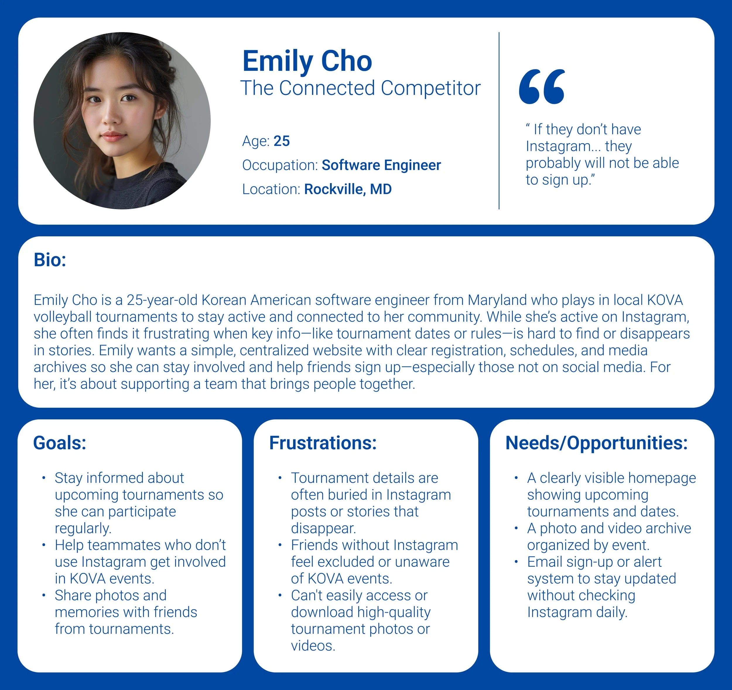
KOVA players need another way to register and see tournament information because it is difficult for people without Instagram to stay informed
POV + HMW 1
How might we make tournament registration and information easily accessible to KOVA players who don’t use Instagram?
KOVA players need a way to access and download high quality photos and videos because it is difficult for people to find the current links
POV + HMW 2
How might we make it easier for KOVA players to access and download high-quality photos and videos from tournaments?
Ideate
Develop a responsive website that features tournament info and photos and keeps people up to date on KOVA events
Solution
What are the most important features to include to achieve this goal?
Feature Roadmap
Prioritize upcoming events and registration for tournaments. Users currently struggle with knowing when tournaments are and how to sign up without social media
Gallery for candid photos and tournament winners’ photos. Photos often get taken at tournaments, but links to photos are difficult to access.
Site Map
How should the website be laid out?
Conducted a hybrid card sort with 5 participants that helped determine the categories for the KOVA website

Prototype
Task Flows
What are the user’s goals?
Task #1: Find Tournament Information and Register

Users can locate upcoming tournament details and register for the tournament using the Google form
Task #2: Find Tournament Winners
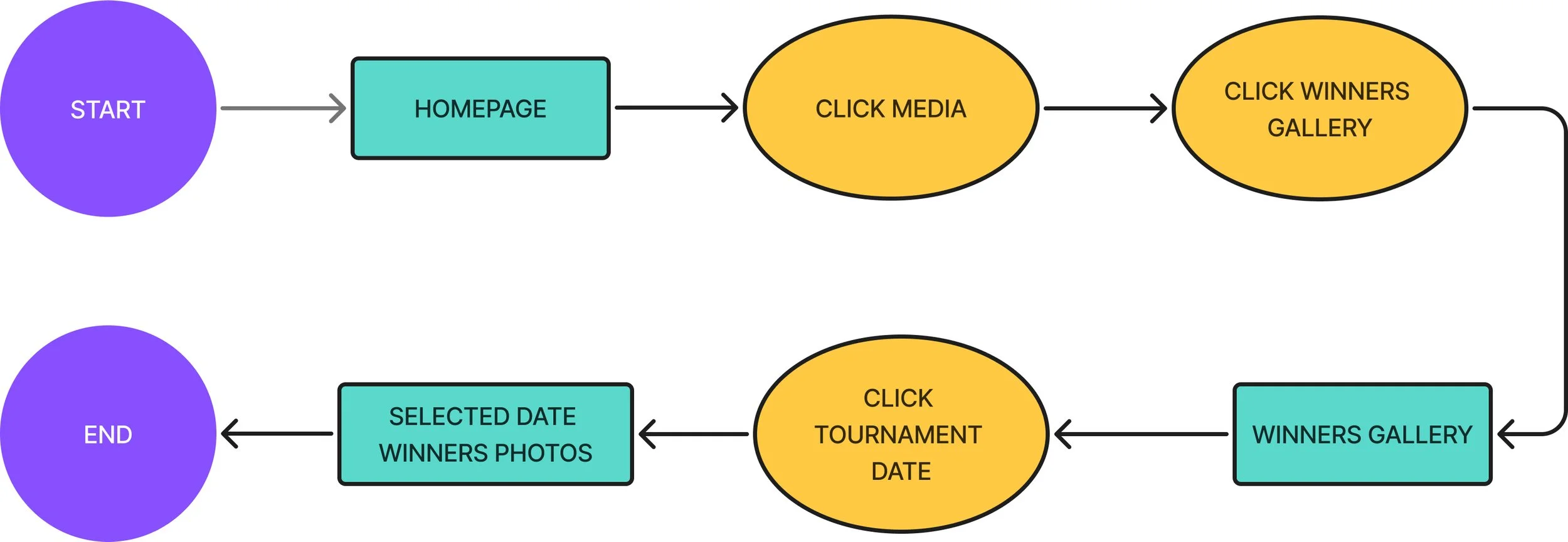
Users can see the winners of any tournament by looking for the date
Task #3: Join Email List
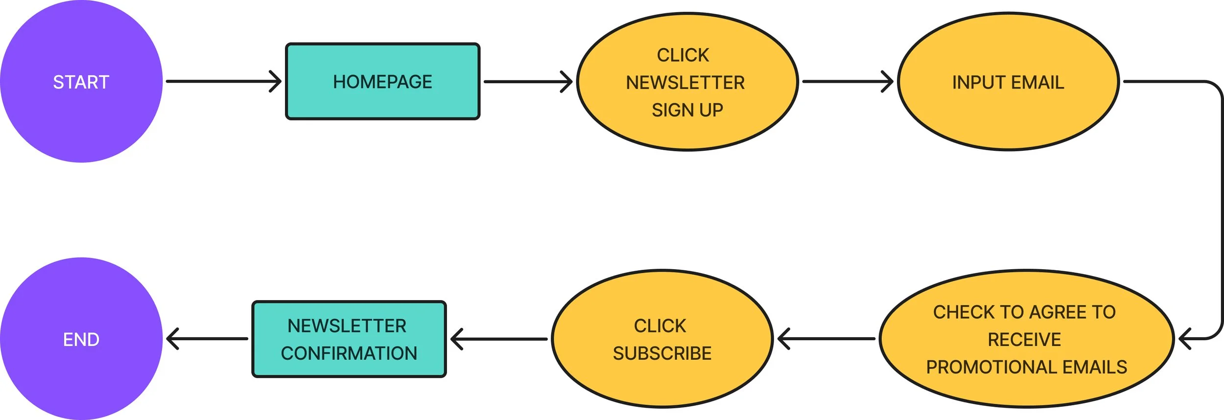
Users can sign up to receive updates about upcoming tournaments through their email
Wireframes
Now let’s design
Low Fidelity
Hand drew key screens for each flow to take into mid-fidelity
Explored different versions of each to get a sense of the look and feel and determine what design would best meet the user’s needs
Mid Fidelity
Brought screens into Figma for mid-fi versions of each flow
High Fidelity Wireframe
Let’s put it all together
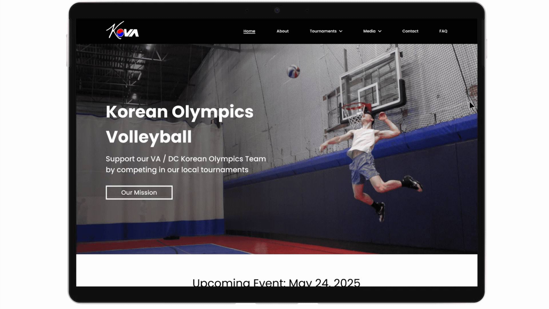
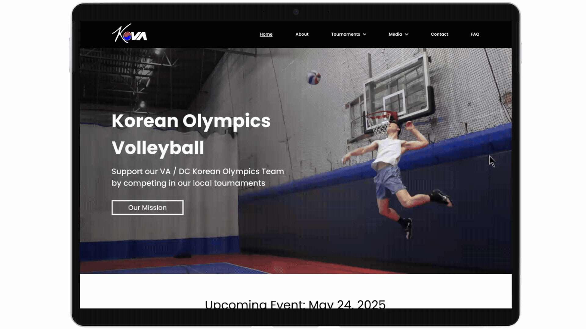
In designing these screens, I focused on making it as easy as possible to find what the user is looking for. All the main tasks can be completed from the home page as well as through the navigation bar. The design is sleek and utilizes the colors of the Korean flag that reflect KOVA’s identity.
Find out important details for the upcoming tournament including date, time, location, cost, etc. and register the team.
Find Tournament Info and Register
See the winners of all tournaments in the winner’s gallery and find specific winners by looking for the tournament date. First and second place winners are featured here.
Find Tournament Winners
Join Email List
Join the email list to be notified about upcoming tournaments / important announcements.
Responsive Screens for Mobile


Test
5
Participants
5 users participated in usability testing using my Figma interactive prototype.
100%
Success Rate
Users easily completed all the tasks with minimal errors in a timely manner.
5/5
Ease of Use
User’s thought prototype was intuitive with minor recs for improvement
Usability Testing Results + Iterations
Where can the KOVA website be improved?
I learned about several fixable pain points in my participants’ process of testing the prototype that regard small changes to improve the flow
1. Allow exploration
Participants wanted to see what happens when non task related buttons are pressed so that they can explore the website in a realistic way.
2. Confusing ‘mailing list’ location
Revised to add mailing list to the ‘Contact’ tab as it was deemed a more intuitive location than under ‘Tournaments’.

Before

After
Added ‘back to top’ button at the bottom of the ‘Winner’s Gallery’ page to reduce scroll time.
3. Add ‘back to top’

Future Iterations
What are next steps for KOVA?
Build out remaining features - many pages of the site were not built as my focus first was on the main 3 task flows
Live sign-up confirmation system - currently players have to be manually confirmed for the tournament, and they desire a live system to see how many people have signed up and how many spots are left
Key Takeaways
What did I learn from creating KOVA’s website?
This was my first project working with real clients, and though the project is not going to be produced for the time being, I learned a lot through this process.
Spend more time exploring and iterating on the visual design of the site before making the full high fidelity prototype
It is important to often reference the persona when making decisions as the persona is who I’m solving for
Clients often don’t know how to articulate their vision for the project, so I learned how to turn vague feedback and unassertive design directions into targeted follow-up questions to better understand the client’s vision