


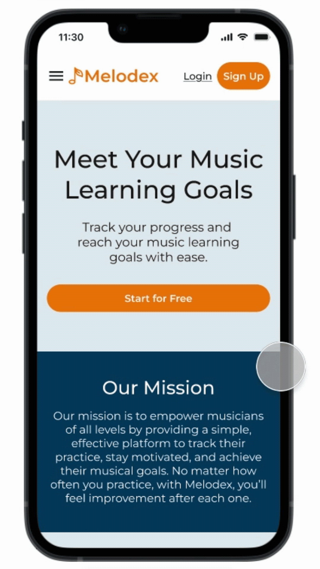
How I elevated music practice with a tool that helps musicians track progress and improvement
Role:
UX/UI Designer
Branding
Project Type:
Mobile-First Responsive Website
Duration:
100+ hours
Tools:
Figma
FigJam
Overview
Why is it so hard to learn a new instrument?
Lots of people set out to learn a new instrument. While many succeed, it is clear based on responses from people I know that it is easy to lose progress and motivation with a busy schedule. It is also difficult to find success in a new skill without a quantitative measure to track progress like so many other new skills allow for.
The Problem
It is easy for people to lose progress and motivation in their music practice with a busy schedule.
The Solution
Develop a responsive website that allows the user to practice with purpose by setting achievable goals before each practice
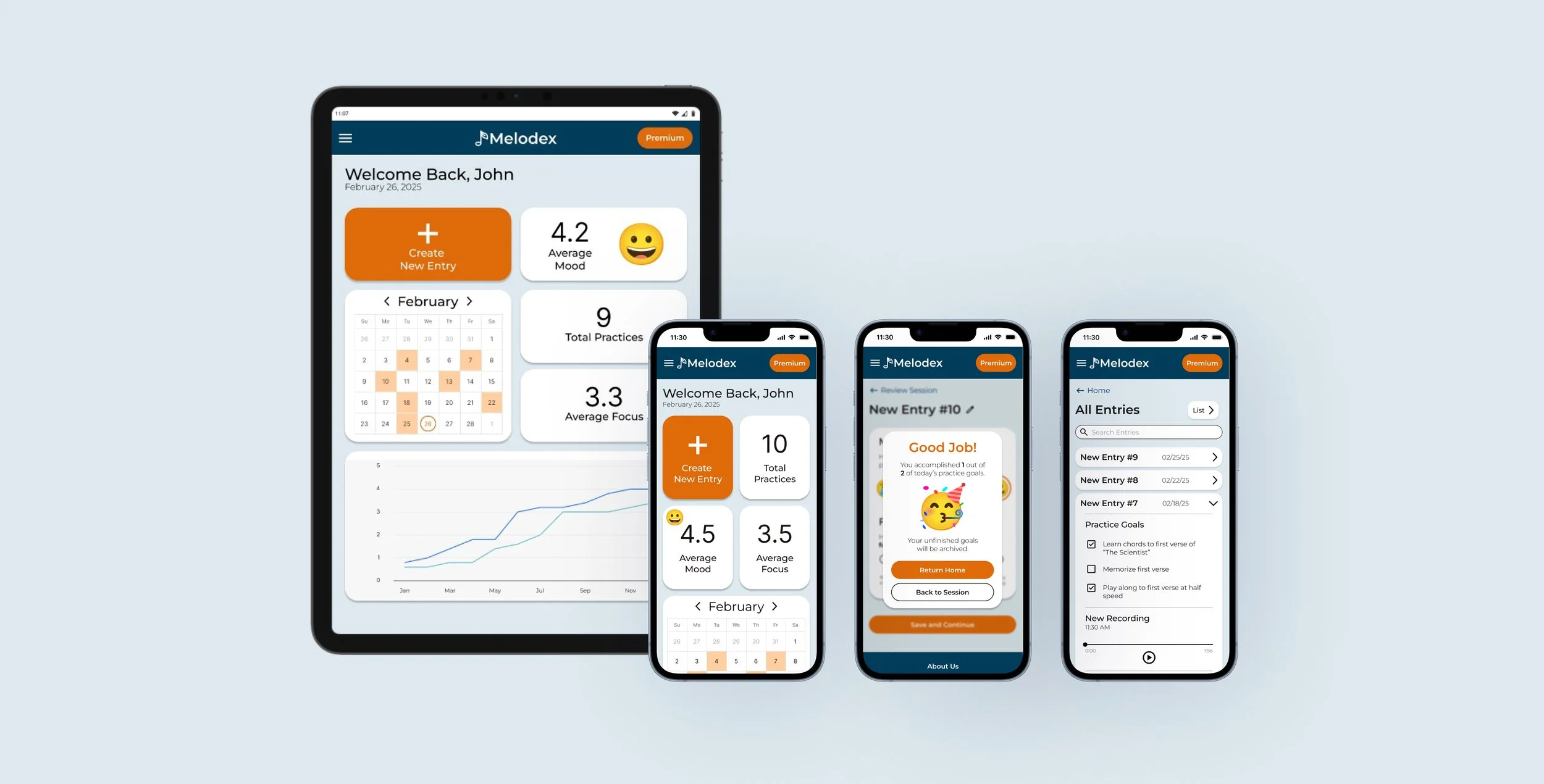
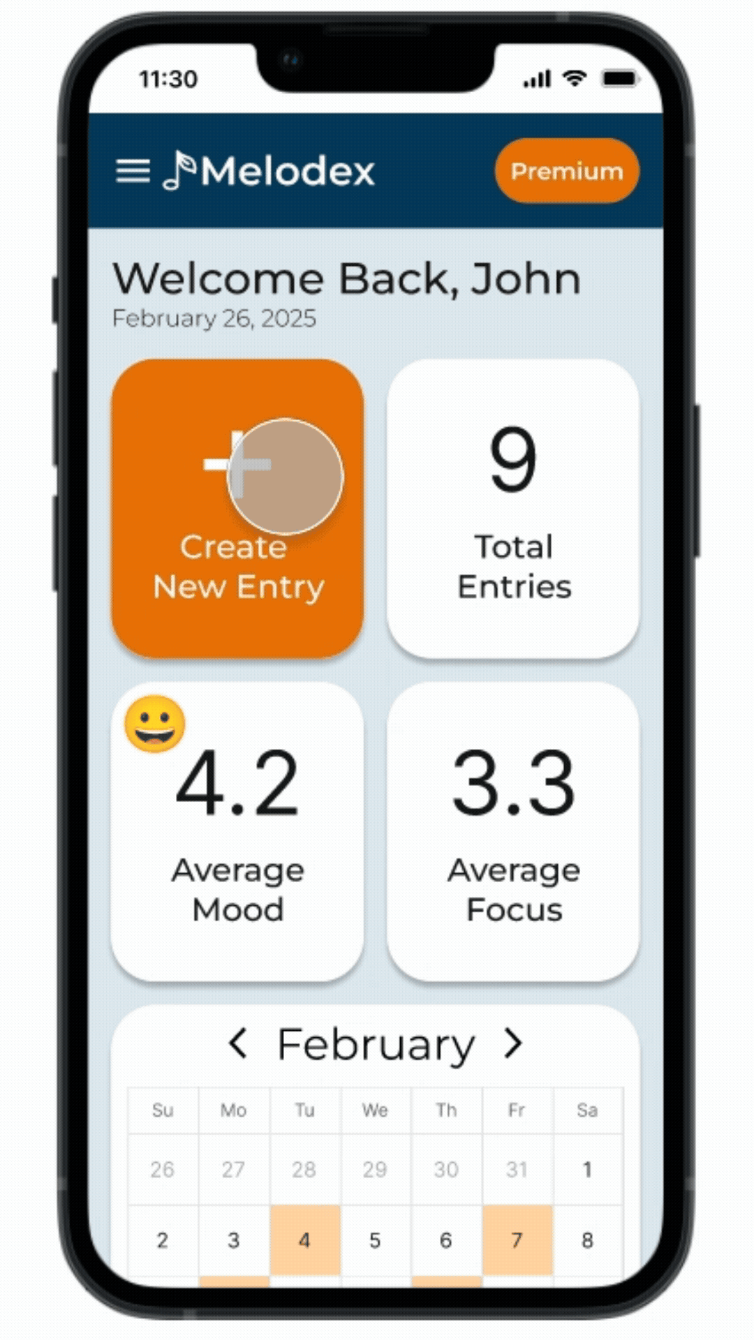
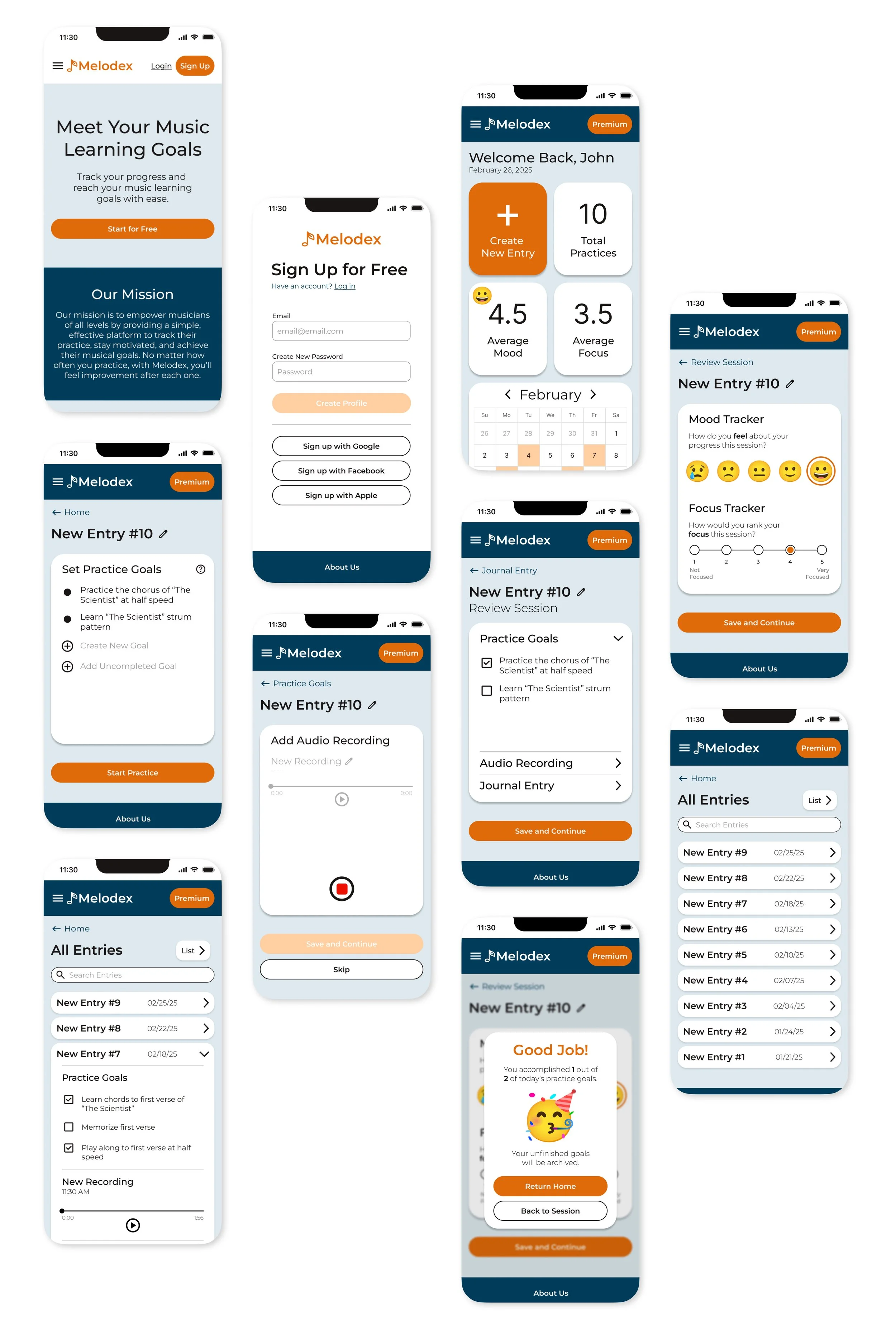
The Final Design
Sign up + create profile to start tracking progress
Users can set goals they want to accomplish during each practice session
Users can use the log of entries to learn from past mistakes and see how far they’ve come
Let’s rewind. What does the research show?
Key findings
Competitive Analysis + User Interviews
Goal setting and slow, effective progression is more important than setting timed deadlines for improvement

Users’ practice often declines when they don’t see improvement at the rate they expected

Users want to learn to play more casually and have more fun with learning

The problem at hand deals less with a loss of motivation and more with a need for effective practice on a flexible timeline
Key Finding
How might we…
…help people who are learning a new instrument avoid frustration from lack of improvement?
Wireframes
My design process
In designing these screens, I focused on making the navigation as straightforward as possible. I used the bright orange for my CTA’s to emphasize what I want the user to do next. Overall, the design is minimal as a way to not overwhelm the user.
Low Fidelity
Mid Fidelity
Final High Fidelity Screens
Responsive Screens for Tablet


5
Participants
5 users participated in usability testing using my Figma interactive prototype.
100%
Success Rate
Users easily completed all the tasks with minimal errors in a timely manner.
4.9/5
Ease of Use
User’s enjoyed the simplicity in the design and flow, and found it easy to navigate.
Future Iterations
What are next steps for Melodex?
Keyword search for named entries - users suggested the ability to search key words to find entries faster
Tutorial / Onboarding flow - users thought a tutorial after signing up would be beneficial to new users
More music related design / features - users noted the visual design does not necessarily look like it is a music app
Premium features - users wanted to see what happens when you sign up for Premium
Key Takeaways
What did I learn from creating Melodex?
As this was my first design project, I’ve learned some things that can make my next project more efficient and more successful
Put more time and energy into low fidelity wireframes to save time later when developing the mid and high fidelity wireframes
Establish a component library early on to spend time in Figma more efficiently
Invest time in finding design inspiration before wireframing to create a better foundation to work from
Want more details?
More case studies

Rewear

YouTube

KOVA