


How I made KOVA more accessible by centralizing tournament information beyond Instagram
Role:
UX/UI Designer
Project Type:
Responsive Website
Duration:
70+ hours
Tools:
Figma
FigJam
Overview
How can we bring more people to KOVA?
KOVA is a DC/VA volleyball team that hosts tournaments throughout the year. It was started in efforts to raise money for players on the team to attend the official Korean Olympics tournament that takes place in a different location every two years. Currently, this team has an Instagram account that features a link to sign up for tournaments in the bio. Pictures are posted when tournament sign ups are open and sometimes show winners of the tournaments. They do not, however, have an official website, so it is difficult to access their information if someone does not use Instagram. The founders have expressed interest in creating a website to give more information and make it more accessible.
The Problem
KOVA only has an Instagram account, making it difficult to sign up for tournaments or find information about the team if someone does not use Instagram.
The Solution
I developed a responsive website that features tournament info and photos and keeps people up to date on KOVA events
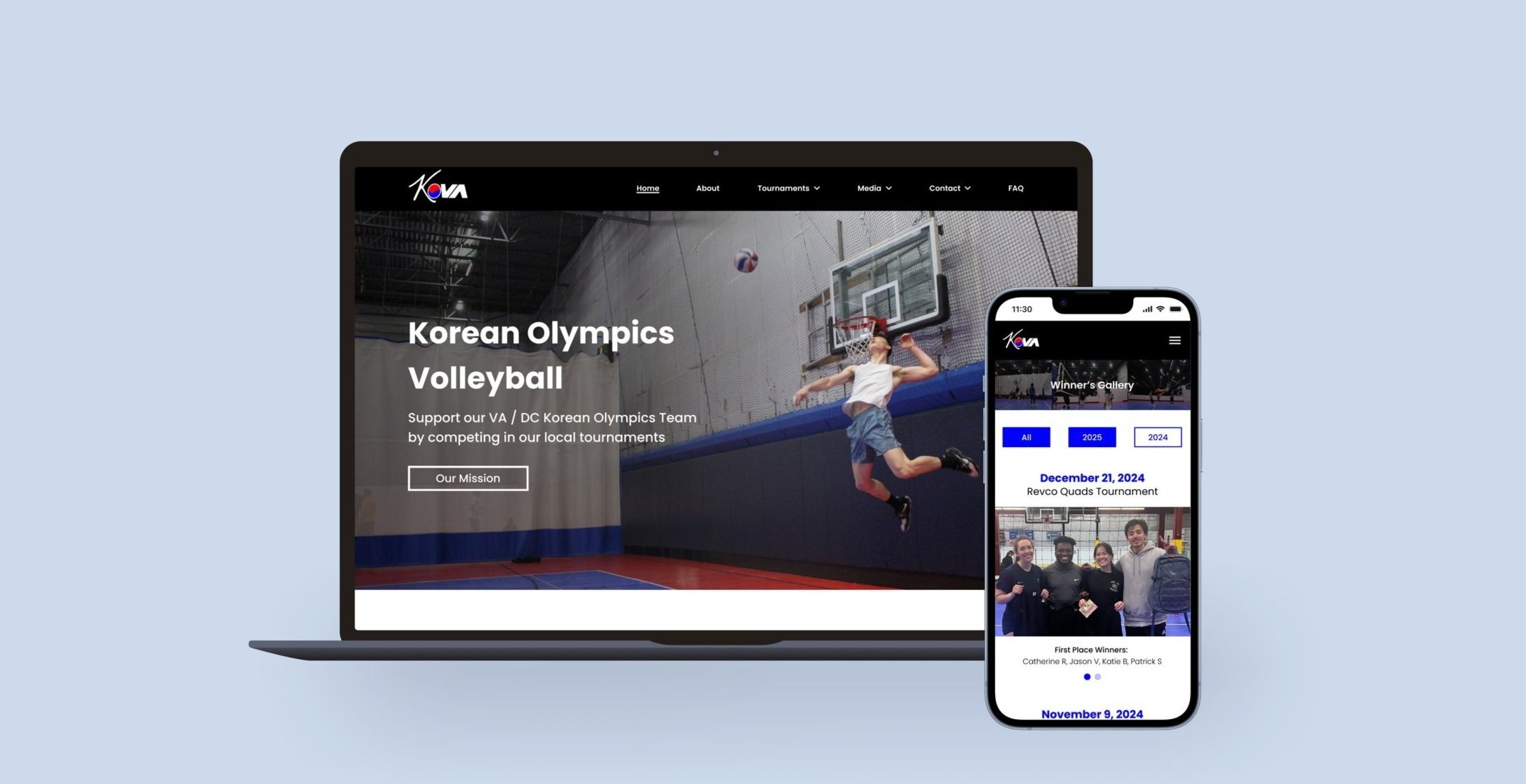
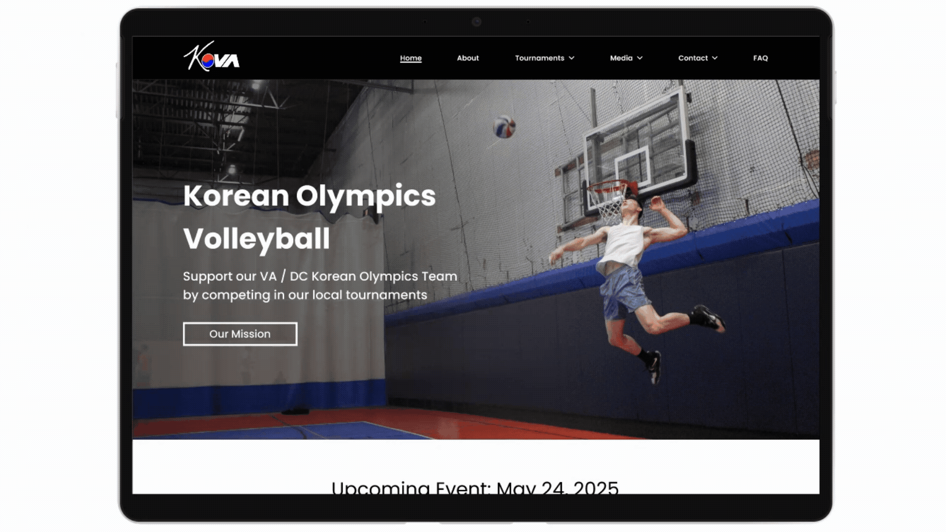
The Final Design
Find upcoming tournament info and register
Find the winners of all tournaments in the Winner’s Gallery
Join email list to be notified about upcoming tournaments
Let’s rewind. What does the research show?
Key findings
Competitive Analysis + User Interviews
Users want to stay informed about upcoming events

Founders want to raise money for the team by hosting tournaments

Users desire access to photos taken at the tournaments

Instagram is not enough for KOVA founders to achieve their goals
Key Finding
How might we…
…make tournament registration and information easily accessible to KOVA players who don’t use Instagram?
Wireframes
My design process
In designing these screens, I focused on making it as easy as possible to find what the user is looking for. All the main tasks can be completed from the home page as well as through the navigation bar. The design is sleek and utilizes the colors of the Korean flag that reflect KOVA’s identity.
Low Fidelity
Mid Fidelity
Final High Fidelity Screens


5
Participants
5 users participated in usability testing using my Figma interactive prototype.
100%
Success Rate
Users easily completed all the tasks with minimal errors in a timely manner.
5/5
Ease of Use
User’s thought prototype was intuitive with minor recs for improvement
Future Iterations
What are next steps for KOVA?
Build out remaining features - many pages of the site were not built as my focus first was on the main 3 task flows
Live sign-up confirmation system - currently players have to be manually confirmed for the tournament, and they desire a live system to see how many people have signed up and how many spots are left
Key Takeaways
What did I learn from creating KOVA’s website?
This was my first project working with real clients, and though the project is not going to be produced for the time being, I learned a lot through this process.
Spend more time exploring and iterating on the visual design of the site before making the full high fidelity prototype
It is important to often reference the persona when making decisions as the persona is who I’m solving for
Clients often don’t know how to articulate their vision for the project, so I learned how to turn vague feedback and unassertive design directions into targeted follow-up questions to better understand the client’s vision

Want more details?
More case studies

Rewear

YouTube

Melodex